Several months with no internet meant I looked to the retro world even more than usual for my gaming. Or at least, as far as the PC goes, to the older games which would actually run on my new computer - which unfortunately did not include
Grim Fandango. Booo! Retuning older games for modern systems is a bandwagon more devs should hop onto. God bless
GOG.com and the various console home arcades. But it does mean that, without the web, I've been kinda limited in options.
On the subject of retro: I know I've said this before and I'm sure I'll say it again, but damn is that word irritating. Gamers of the world, I implore you to stop describing old games as retro! Around Christmas time I rewatched
It's a Wonderful Life and it's not a 'retro' film. It's just a film. A film which, despite technical limitations in its production compared to modern releases, and the subsequent years' advancement of cinematic techniques and a shifting of the preconceptions of good storytelling, is still every bit as enjoyable as anything you'll see at the pictures this year.
Similarly, despite their technical ineptitude by modern standards, I've been thoroughly enjoying the
Micro Machines,
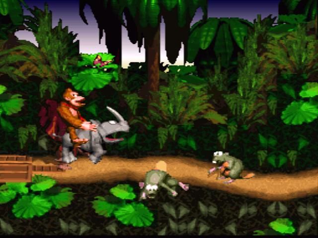
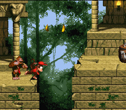
Donkey Kong Country and
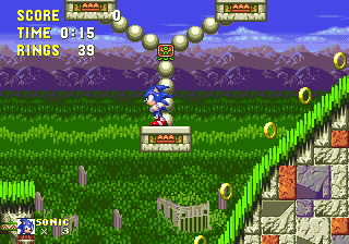
Sonic the Hedgehog series, and the original
Grand Theft Auto has lost barely anything despite the advances of its successors. Even ancient Disney tie-in
Aladdin was as playable today as it was in 1993. The original
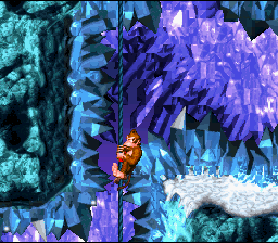
Donkey Kong Country is the most revealing game from a technological standpoint - can you believe it was once considered
the cutting edge of photorealism? I wonder if the kids of today could even see the difference in quality between
its graphics and
those of Sonic 3, a difference which seemed so vast to us at the time. Nonetheless, the visuals do everything they need to do to make the game playable, while still looking charmingly pretty in a - sigh - 'retro' sort of way. Maybe the
ice cave levels don't make me feel physically cold anymore, but the big Rareware eyes on all the enemies are still lovely.
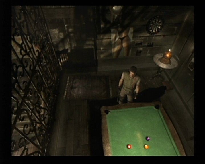
Moving ahead a few years, the GameCube remake of
Resident Evil is
still stunningly beautiful, and not just in consideration of when it was released. It's both confirmed and countered
my arguments against the pursuit of graphic fidelity - rendered stills are obviously a lot easier to make realistic than moving images are, and the near-realism of the backgrounds is a big part of the atmosphere. But at the same time, so much attention has been paid to the architecture, the furnishings, and even the drapery that the enhanced visuals are clearly not just a sales point - it's Shinji Mikami finally getting to make this world look the way it always did in his head. The Spencer Mansion and Arklay Laboratory feel like real places, places I know as well as any house I've actually, personally lived in.
Of course improvements could be made - physics-based elements like water, particle effects and shadows are unimpressive by today's standards, ditto the resolution. But aside from such processing updates, and the plastic look to character faces which current games still suffer from anyway, it's hard to see where the graphics could be improved. It's a harmonious case of technological wizardry being applied by talented visual designers who maximise the artistic opportunities said wizardry affords, and the result means that a decade on it remains one of the best-looking games in existence. The most advanced thing I got to play during my fallow months was the PC demo of
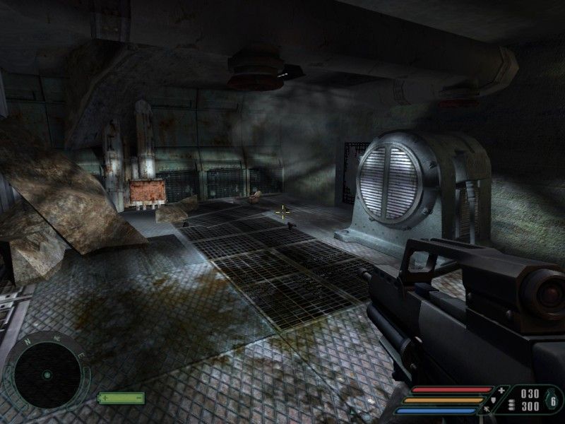
Arkham Asylum - no longer cutting edge, admittedly, but I will state without hyperbole that GameCube
Resident Evil is the better looking game for all the jagged, pixelly edges and blocky shadows. That said, some areas of
Arkham Asylum are moderately impressive in aesthetic design terms too, and it'll be interesting to see how it holds up in years to come. By the by, I was pleasantly surprised by how fluidly
Arkham Asylum plays on PC - control-wise, it's just as smooth as the 360 version, perhaps even moreso. Having subsequently completed the game on PC, there were only a handful of places where I'd have preferred a pad.
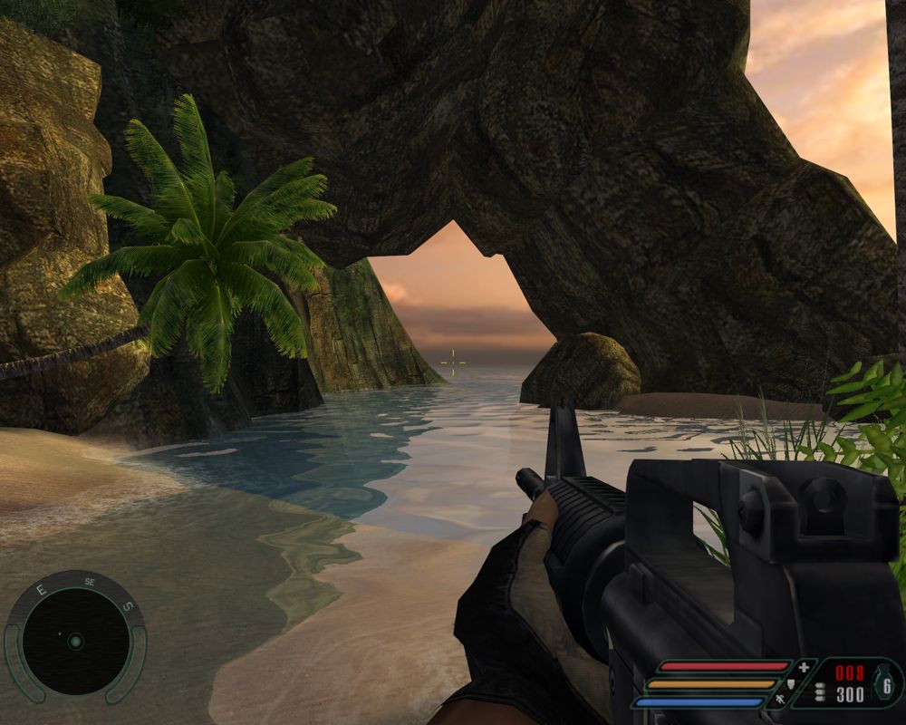
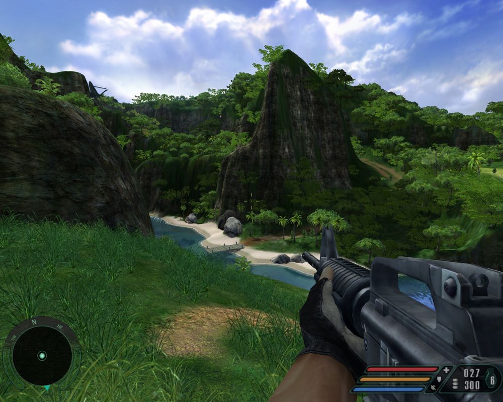
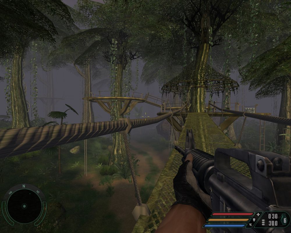
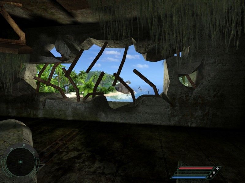
Sadly, onetime kingpin
Far Cry's graphics simply don't excite me anymore. The aesthetic design was interesting enough, but leaned heavily on technical splendour for its
lighting effects,
draw distances and
lush vegetation. These days, such things have all been bettered many times, and now it's hard not to notice how often plant models are repeated, or how the sunlight lancing through cracked walls just doesn't seem as bright as it once did (I've gained a new appreciation for High Dynamic Range since replaying
Far Cry, that's for sure).
Far Cry is certainly not ugly - but the bits which interest me most now are the
bombed-out husks and
concrete bunkers, which for a game so heavily based around creeping through dense jungles, and hopping between paradise islands, seems like something of a failure. I happily acknowledge that we have
Far Cry to thank for the quality of modern graphics, but ultimately it remains tied to its era much more than any other game I've discussed so far.
I now know I'm not alone in my stance that the rabid pursuit of better graphics is as much a curse as a boon; I signed up to the official
Carmageddon: Reincarnation fan forum before losing my net, and when the developers asked what we wanted to see in the game, the majority view was that physics and content - rather than cutting edge visuals - need to be the primary foci during development. I'll refine that here. Graphics are important, as the most immediate and visceral connection we get with a game, and as a sales-driving element, but more than overall fidelity what graphics need is to suit the game. For example,
Carmageddon doesn't need to be too concerned with peds having perfect musculature and swaying fabric, but it would benefit greatly from per-pixel lighting, neon signs reflecting realistically off grime, oil and twisted metal - a moody atmosphere is key to
Carmageddon. Fabric and musculature are of great importance to
The Sims on the other hand, but lighting isn't so important there. And in
FIFA, I don't care about every line on Coloccini's face being perfectly modelled half as much as I care about his passes and strikes being as fluidly realistic as possible. Every blade of grass on the pitch being individually rendered is excellent if it means the ball bounces more believably, but if it's purely for show, I don't think it's a productive use of development time.
Of course, on top of all that, graphics need to be creatively engaging; the problem with
Far Cry is that its aesthetic interest was too dependent on technical advancements alone. If
Carmageddon: Reincarnation is evocatively dirty and worn, nails that near-present dystopia without becoming
Blade Runner cyberpunk, and features at least a few cars that look like real machines which have been customised rather than pure fantasy creations, then I'm happy. Graphical genius is a bonus, not a requirement. And judging by the
Carmageddon concept art released so far, I'm going to be very happy indeed.
Some games were plain ugly first time round, of couse. A couple of titles I've come back to recently are
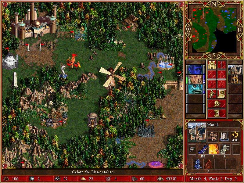
Heroes of Might & Magic III and
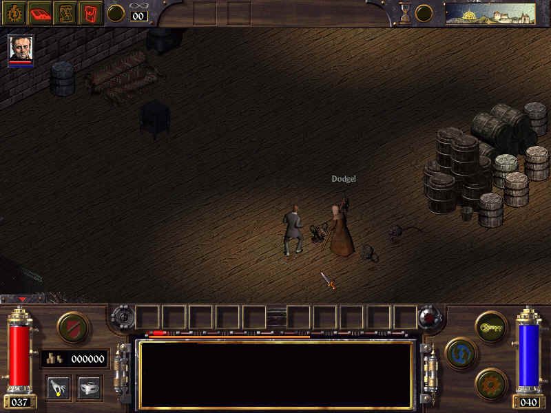
Arcanum: Of Steamworks & Magic Obscura. Each of those, on release, was widely decried for looking like a big pile of pixellated puke.
Arcanum's
spartan environments couldn't compete with
Baldur's Gate 2, its closest contemporary - and yet today, I find something charming in
Arcanum's stiff appearance. Its muddy grey scrubland, gleaming brass and starched petticoats may lack warmth, but that's in keeping with the cruel, repressed world in which it's set, and the faceless, rigidly mannequin-like character models are almost as appropriate as the old-fashioned maps and wood panel HUD.
Heroes III takes the opposite tack, and tries to
pack every screen with as many bright colours, outlandish creatures and incidental details as possible. It's a game bursting with life and humanity despite poor visuals - if anything, it's too cluttered, but then that was always the case, really. It remains a weird contrast to see stiff, jerky movements in sprites with such colourful, fantastical design, and these days they look rather like puppets or automatons. But even in development, 3DO must have known the game would not be breaking any technical barriers, and the upshot is that they designed a game which is functional enough to be as playable today as it was in 1999, and while not conventionally pretty, is at least interesting looking - call it the Agyness Deyn of strategy games.
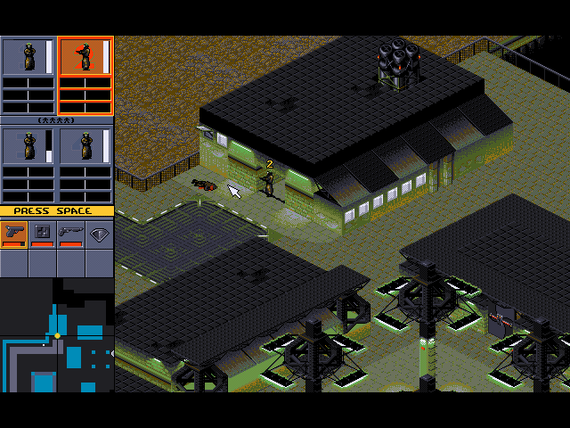
Syndicate, by contrast, has been a struggle to play nowadays. The graphics
weren't terribly clear or engaging at the time, and now, it's difficult to know what's going on, and to distinguish your own squad from both the enemy and from civilians. It's still a good game, but requires a lot more perseverance than any other title I've mentioned. Not being able to see inside buildings when you enter them was a minor frustration back then; today, it's painfully out of step with how we expect to play games, and that's just one example of many issues it has. Syndicate's graphics are still fairly crisp, I'll give it that, and it was obviously made with a strong aesthetic in mind, but not enough thought was given to the necessities of gameplay. It stands a reminder that the balance between the technical and artistic is not the only one which must be struck.
The one vaguely recent PC game I got a chance to play in the winter months was the indie physics platformer
NightSky, which is suprisingly entertaining. Much like
Braid, NightSky hits a great equilibrium of visual elements. Technical proficiency means it runs smoothly while handling the physics puzzles, the aesthetic design is strikingly beautiful, and it's always clear and readable from a gameplay perspective. Compare that to
Super Meat Boy which suffered from occasional lag or camera overshoot, to
Alien Hominid and
Viewtiful Joe, in which the gameplay elements weren't always distinguishable from the background, or to
Limbo in which the main character was intentionally designed to look like part of the background.
Courtesy of Evis T and his portable gadgetry, I also had fun with the wonderful Android games
Cut The Rope and
Dragon, Fly!, which similarly match the visuals to the game effectively - both are a lot crisper than, say,
Fruit Ninja or
Burn The City, but
Fruit Ninja's bright colours suit it more than cartoonish line drawings would, while
Burn The City doesn't need to be especially clear because it's a bit more sedentary. It's not a new trend, of course; I've revistited a couple of indie games from a few years back like
Ocular Ink, which is quite ugly but appropriately uncluttered for a fast paced game of drawing, and
The White Chamber, which I'll talk about in more detail soon - for now, one thing I love about it is how subtly different the useable elements of the game world look from the non-useable. There's no need for tedious pixel sweeping. but at the same time, they don't stick out like a sore thumb, so you still have to pay attention, and for a point and click adventure that's one of the magic elements which can make a good game into a great game.
A cautionary tale to close this post, regarding picking up old games: I came back to
Chrono Trigger after almost a year and had no idea how far through I was or what I was supposed to be doing. I left off my
Secret of Mana playthrough even longer ago than that, and I expect I'll probably just need to start again.


